

Client: White Ensign Association (WEA)
Project: Brochure Design, Flyer Design & Marketing Collateral Design
Boosting the impact of a vital veterans’ charity
In 2024, the White Ensign Association, a 66-year-old charity that provides personal and financial advice, career transition support, and welfare guidance for those leaving the Royal Navy or Royal Marines, approached us for help with their visual design to increase the reach of their vital services. Here’s how we were able to help them:
Working with the White Ensign Association (WEA) over the past few years has been a rewarding experience, allowing us to apply thoughtful design science to a variety of print projects, each with its own goals and audience expectations.
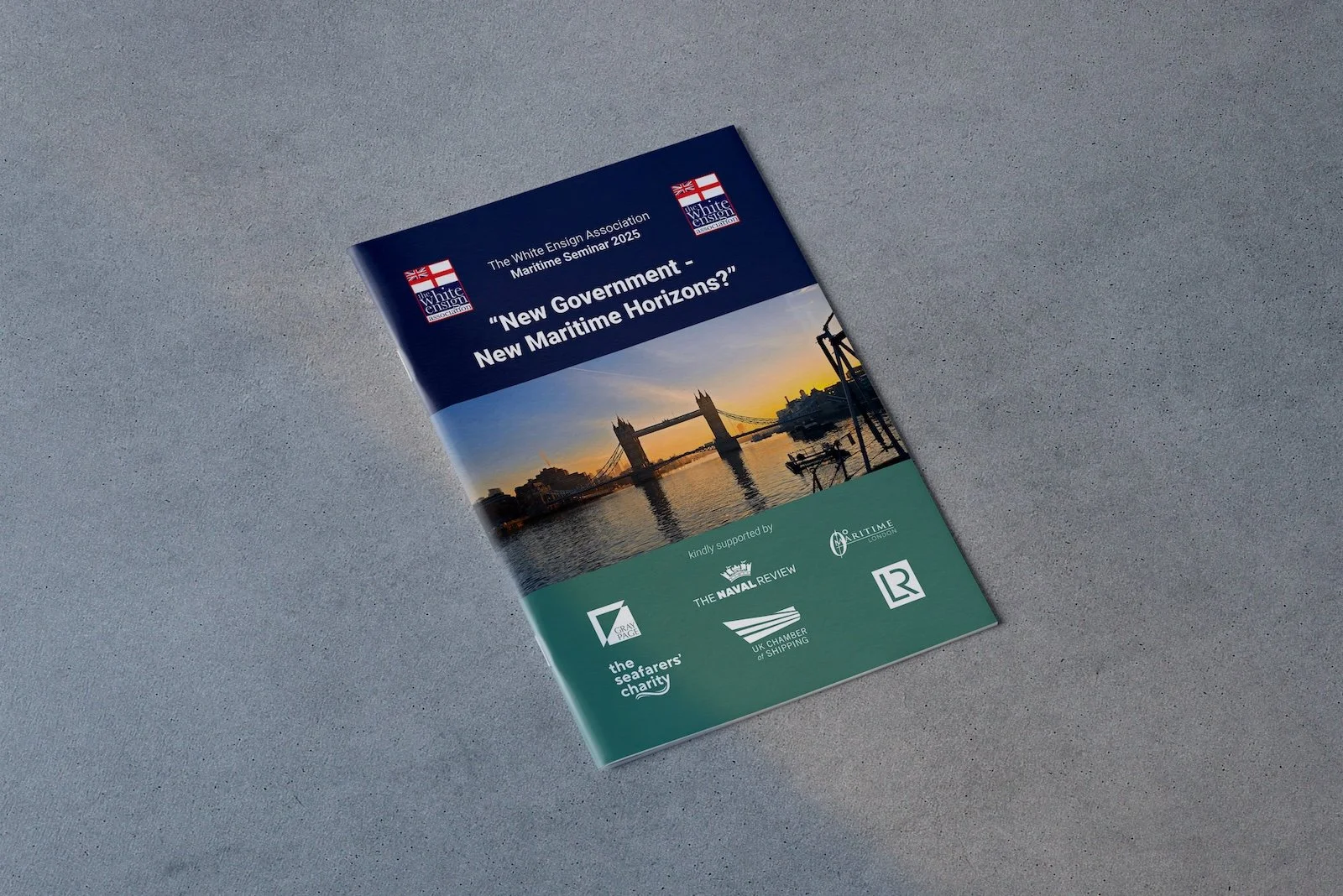
Seminar Brochures
For the seminar brochures, our priority was clarity and ease of navigation. We used cognitive load theory to structure the content in digestible sections, ensuring that veterans and their families could quickly find key event details.
Semiotics played an important role too: we chose trustworthy, traditional colours and respectful imagery that reinforced the WEA’s heritage and credibility. Gestalt principles guided how we grouped information, so each page felt ordered and logical.
Flyers
When designing flyers, we focused on instant impact and quick comprehension. Here, the Picture Superiority Effect shaped our approach, bold visuals and clear headlines helped capture attention, even at a glance on a noticeboard or in a stack of leaflets.
Visual hierarchy was vital: the most critical information (dates, times, calls to action) was given prominence through size, colour and positioning. We also considered Fitts’ Law where relevant, placing any QR codes or contact prompts where people’s hands naturally reach.
Magazine Adverts
For the full-page magazine adverts, the challenge was to stand out within crowded editorial layouts. We leaned heavily on semiotics and visual hierarchy to craft ads that balanced strong imagery with concise, persuasive copy.
Gestalt principles ensured the ad elements didn’t feel cluttered but led the eye smoothly from headline to call to action. By understanding how readers skim magazines, we made sure key messages could be absorbed in seconds.

Across all projects, working with the WEA has been collaborative and respectful. Their openness to design science, paired with their commitment to clear, dignified communication, made every project a pleasure to deliver.